[TOC]
柱状图(bar)示例
1. 一些配置项说明
1.1 series[0].label.formatter 说明
https://echarts.apache.org/zh/option.html#series-bar.label.formatter
标签内容格式器,支持字符串模板和回调函数两种形式,字符串模板与回调函数返回的字符串均支持用 \n 换行。
例子:
let label = {
  formatter: '{c}', // 显示数据值
  formatter: function(params) {
    // 根据数值返回不同评级
    if (params.value < 60) return '不及格';
    if (params.value < 70) return '及格';
    if (params.value < 80) return '良好';
    return '优秀';
  }
}
// 带富文本的
label = {
  show: true,
  formatter: function (params) {
    // 使用富文本标记语法
    return `{title|${params.name}}\\n{value|${params.value}}`;
  },
  rich: {
    title: {
      color: "#333",
      fontSize: 14,
      fontWeight: "bold",
    },
    value: {
      color: "#1890ff",
      fontSize: 16,
      backgroundColor: "#f0f8ff",
      padding: [2, 4],
    },
  },
};
字符串模板 模板变量有:
{a}:系列名。{b}:数据名。{c}:数据值。{@xxx}:数据中名为'xxx'的维度的值,如{@product}表示名为'product'的维度的值。{@[n]}:数据中维度n的值,如{@[3]}表示维度 3 的值,从 0 开始计数。
回调函数
回调函数格式:
(params: Object|Array) => string
参数详解
-
params参数:是一个对象,包含当前数据点的详细信息,常用属性包括:params.data:当前数据项的值params.dataIndex:当前数据项的索引值params.seriesName:当前系列的名称params.name:数据名(x轴坐标值)params.value:数据值(y轴坐标值)
返回格式
函数必须返回一个字符串,可以是:
- 纯文本内容
- 包含 HTML 标签的富文本(需配合
rich配置使用)4 - 使用模板变量如
{c}表示数据值3
2. 一些实际例子
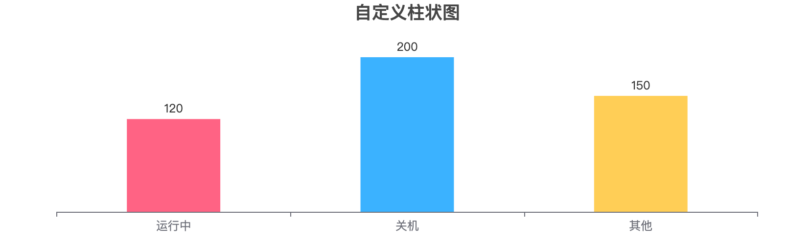
2.1 每个数据显示不同颜色,不显示Y轴信息
效果如下图:
代码:
import * as echarts from 'echarts';

var chartDom = document.getElementById('main');
var myChart = echarts.init(chartDom);
var option;

option = {
  title: {
    text: '自定义柱状图',
    left: 'center'
  },
  xAxis: {
    type: 'category',
    data: ['运行中', '关机', '其他'] // 每个柱子的X轴名称
    // 设置X周文字显示旋转
    // axisLabel: {
    //   rotate: 30
    // }
  },
  // 设置不显示Y轴信息
  yAxis: { type: 'value', show: false },
  series: [
    {
      type: 'bar',
      data: [
        { value: 120, name: '运行中', itemStyle: { color: '#FF6384' } },
        { value: 200, name: '关机', itemStyle: { color: '#36A2EB' } },
        { value: 150, name: '其他', itemStyle: { color: '#FFCE56' } }
      ],
      // 图形上的文本标签,可用于说明图形的一些数据信息,比如值,名称等。
      label: {
        show: true,
        position: 'top',
        formatter: '{c}', // 显示数据值
        // color: '#333', // 设置显示字体颜色
  			// fontSize: 12,  // 设置显示字体的大小
      },
      // 柱子宽度
      barWidth: '40%'
    }
  ]
};

option && myChart.setOption(option);
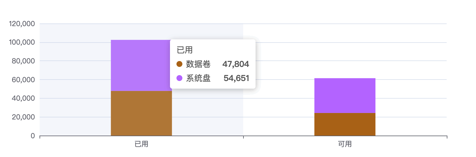
2.2 堆叠柱状图
效果如下图:
代码:
var option = {
  tooltip: {
    trigger: 'axis',
    axisPointer: {
      type: 'shadow'
    }
  },
  xAxis: {
    type: 'category',
    data: ['已用', '可用']
  },
  yAxis: {
    type: 'value'
  },
  color: ['#b8741a', '#c280ff'],
  series: [
    {
      name: '数据卷',
      type: 'bar',
      stack: 'Ad',
      emphasis: {
        focus: 'series'
      },
      data: [47804, 24230],
      // 柱子宽度
      barWidth: '30%'
    },
    {
      name: '系统盘',
      type: 'bar',
      stack: 'Ad',
      emphasis: {
        focus: 'series'
      },
      data: [54651, 37200]
    }
  ]
};
option && myChart.setOption(option);
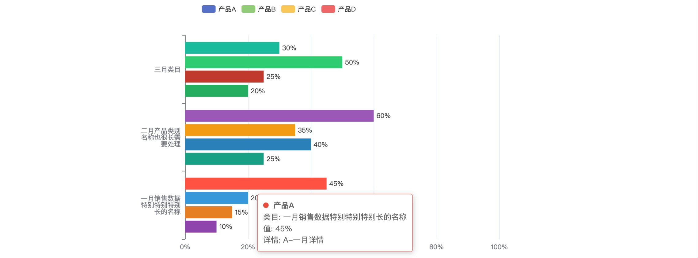
2.3 柱状图横向显示,成组出现
这个图标特点:
1、横向显示,每个坐标点成组出现。
2、坐标点名字超长,设置方法换行显示。
3、鼠标移到柱子上会显示详情信息。
4、每个柱子颜色不一样。
效果如下图:
代码:
const chart = echarts.init(document.getElementById('chart'));

const categories = [
  '一月销售数据特别特别特别长的名称',
  '二月产品类别名称也很长需要处理',
  '三月类目'
];

// 工具函数:长标签自动换行
function wrapLabel(value, maxLength = 6) {
  if (!value) return '';
  const rowCount = Math.ceil(value.length / maxLength);
  let result = '';
  for (let i = 0; i < rowCount; i++) {
    const start = i * maxLength;
    const end = start + maxLength;
    result += value.substring(start, end);
    if (i < rowCount - 1) result += '\n';
  }
  return result;
}

// 在柱状图的末端/顶部 显示值
const labelOption = {
  show: true,
  position: 'right',  // 横向条形图,数字在右边显示(柱子末端)
  formatter: '{c}%',  // 显示值+百分号
  color: '#333',
  fontSize: 12
};

const option = {
  // 鼠标放到 柱子上出现弹窗显示的内容
  tooltip: {
    trigger: 'item',
    formatter: function (params) {
      return `
        <div>
          ${params.marker} <strong>${params.seriesName}</strong><br/>
          类目: ${params.name} <br/>
          值: ${params.value}%<br/>
          详情: ${params.data.info || '无'}
        </div>
      `;
    }
  },
  // 数据标识
  legend: {
    data: ['产品A', '产品B', '产品C', '产品D']
  },
  // 图表距离容器边缘位置
  grid: { left: '5%', right: '10%', bottom: '10%', containLabel: true },
  // X轴坐标
  xAxis: {
    type: 'value',
    // 显示单位
    axisLabel: { formatter: '{value}%' },
    max: 100
  },
  yAxis: {
    type: 'category',
    data: categories,
    axisLabel: {
      formatter: function (value) {
        return wrapLabel(value, 6);
      }
    },
    triggerEvent: true
  },
  series: [
    {
      name: '产品A',
      type: 'bar',
      label: labelOption,
      data: [
        { value: 45, info: 'A-一月详情', itemStyle: { color: '#e74c3c' } },
        { value: 60, info: 'A-二月详情', itemStyle: { color: '#9b59b6' } },
        { value: 30, info: 'A-三月详情', itemStyle: { color: '#1abc9c' } }
      ]
    },
    {
      name: '产品B',
      type: 'bar',
      label: labelOption,
      data: [
        { value: 20, info: 'B-一月详情', itemStyle: { color: '#3498db' } },
        { value: 35, info: 'B-二月详情', itemStyle: { color: '#f39c12' } },
        { value: 50, info: 'B-三月详情', itemStyle: { color: '#2ecc71' } }
      ]
    },
    {
      name: '产品C',
      type: 'bar',
      label: labelOption,
      data: [
        { value: 15, info: 'C-一月详情', itemStyle: { color: '#e67e22' } },
        { value: 40, info: 'C-二月详情', itemStyle: { color: '#2980b9' } },
        { value: 25, info: 'C-三月详情', itemStyle: { color: '#c0392b' } }
      ]
    },
    {
      name: '产品D',
      type: 'bar',
      label: labelOption,
      data: [
        { value: 10, info: 'D-一月详情', itemStyle: { color: '#8e44ad' } },
        { value: 25, info: 'D-二月详情', itemStyle: { color: '#16a085' } },
        { value: 20, info: 'D-三月详情', itemStyle: { color: '#27ae60' } }
      ]
    }
  ]
};

chart.setOption(option);

// 鼠标移到Y轴坐标上悬停显示完整信息(tooltip)
chart.on('mouseover', function (params) {
  if (params.componentType === 'yAxis') {
    chart.dispatchAction({
      type: 'showTip',
      seriesIndex: 0,
      name: params.value,
      position: 'top',
      dataIndex: categories.indexOf(params.value)
    });
  }
});
chart.on('mouseout', function (params) {
  if (params.componentType === 'yAxis') {
    chart.dispatchAction({ type: 'hideTip' });
  }
});