[TOC]
CSS简单效果样式
1. 高度自适应屏幕高度
例子: 网站底部的版权条,当内容不足一屏的时候显示在屏幕的底部,在内容超过一屏的时候显示在所有内容的底部。
使用flex布局:
<style>
    .container { display: flex; min-height: 100vh;
        flex-direction: column;
    }
    header { background: #cecece; min-height: 100px;
    }
    content { background: #bbbbbb;
        flex: 1; /* 1 代表盡可能最大,會自動填滿除了 header footer 以外的空間 */
    }
    footer { background: #333333; min-height: 100px; }
</style>
<div class="container">
  <header></header>
  <content></content>
  <footer></footer>
</div>
这样<footer>就会在底部了。
参考资料:https://blog.csdn.net/u014374031/article/details/69258208
2. a标签去掉下划线
<style type="text/css">
a:link,a:visited{
 text-decoration:none;  /*超链接无下划线*/
}
a:hover{
 text-decoration:underline;  /*鼠标放上去有下划线*/
}
</style>

<a href="#">超链接</a>
3. input输入框相关
3.1 输入时去掉默认蓝边
input:focus {
  outline: none;
}
3.2 placeholder字体颜色修改
input {
    &::-webkit-input-placeholder { /* WebKit browsers*/
        color:#999;
        font-size: 20px;
    }
    &:-moz-placeholder {  /* Mozilla Firefox 4 to 18*/
        color:#999;
    }
    &::-moz-placeholder {  /* Mozilla Firefox 19+*/
        color:#999;
    }
    &:-ms-input-placeholder { /* Internet Explorer 10+*/
        color:#999;
    }
}
3.3 input复选框CheckBox默认演示纯CSS修改
<input type="checkbox" name="btn" id="btn1"><label for="btn1">按钮2</label>
<style>
  input[type="checkbox"]{
    width:20px;
    height:20px;
    display: inline-block;
    text-align: center;
    vertical-align: middle;
    line-height: 18px;
    position: relative;
  }
  input[type="checkbox"]::before{
    content: "";
    position: absolute;
    top: 0;
    left: 0;
    background: #fff;
    width: 100%;
    height: 100%;
    border: 1px solid #d9d9d9;
  }
  input[type="checkbox"]:checked::before{
    content: "\2713";  // “\2713”实体符号√
    background-color: #fff;
    position: absolute;
    top: 0;
    left: 0;
    width:100%;
    border: 1px solid #e50232;
    color:#e50232;
    font-size: 20px;
    font-weight: bold;
  }
</style>
4. div相关
4.1 div模拟textarea文本域实现高度自适应
<div class="textarea" contenteditable="true"><br /></div>
<style>
  .textarea{
    width: 200px;
    min-height: 20px;
    max-height: 300px;
    _height: 120px;
    margin-left: auto;
    margin-right: auto;
    padding: 3px;
    outline: 0;
    border: 1px solid #a0b3d6;
    font-size: 12px;
    line-height: 24px;
    padding: 2px;
    word-wrap: break-word;
    overflow-x: hidden;
    overflow-y: auto;

    border-color: rgba(82, 168, 236, 0.8);
    box-shadow: inset 0 1px 3px rgba(0, 0, 0, 0.1), 0 0 8px rgba(82, 168, 236, 0.6);
  }
</style>
4.2 横线从左到右颜色渐变
效果:
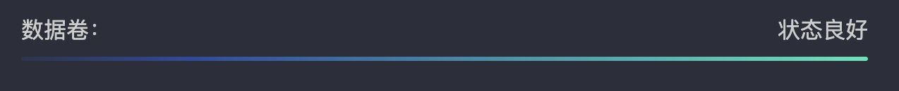
代码:
<style>
  body { background-color: #2b2f3a; color: #ccc; padding: 20px; }
  .label {
    display: flex; justify-content: space-between;
    margin-bottom: 8px; font-size: 16px;  width: 600px;
  }
  .gradient-line {
    height: 3px; /* 横线的粗细 */
    border-radius: 5px; width: 600px;
    /* 有多种颜色 */
    background: linear-gradient(
      to right,
      rgba(47, 97, 255, 0.1) 0%,   /* 左边完全透明 */
      rgba(47, 97, 255, 0.5) 20%, /* 渐变到蓝色 */
      rgba(47, 228, 183, 1) 100% /* 右边青绿色 */
    );
    /*只有2种颜色的写法:background: linear-gradient(to right, #2f61ff, #2fe4b7); */
  }
</style>
<body>
  <div class="label">
    <span>数据卷:</span>
    <span>状态良好</span>
  </div>
  <div class="gradient-line"></div>
</body>
4.3 竖线渐变显示
效果:
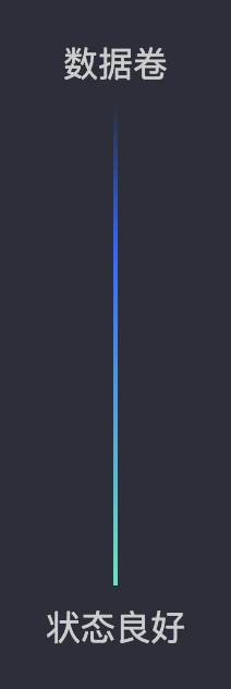
代码:
<style>
  body {
    background-color: #2b2f3a; color: #ccc; padding: 20px; display: flex; align-items: center;
  }
  .label { display: flex; flex-direction: column; align-items: center; gap: 8px; }
  .gradient-vertical-line {
    width: 2px;   /* 竖线粗细 */
    height: 220px; /* 竖线高度,可以自行调整 */
    background: linear-gradient(
      to bottom,
      rgba(47, 97, 255, 0) 0%,   /* 顶部透明 */
      rgba(47, 97, 255, 1) 30%, /* 渐变到蓝色 */
      rgba(47, 228, 183, 1) 100% /* 底部青绿色 */
    );
  }
</style>
<body>
  <div class="label">
    <span>数据卷</span>
    <div class="gradient-vertical-line"></div>
    <span>状态良好</span>
  </div>
</body>
5. 文本、文字相关
5.1 禁止文字被选中
HTML:
<div class="tt">你好,测试禁止选中文本</div>
CSS:
.tt {
   -o-user-select: none;
  -moz-user-select: none; /*火狐 firefox*/
  -webkit-user-select: none; /*webkit浏览器*/
  -ms-user-select: none; /*IE10+*/
  -khtml-user-select :none; /*早期的浏览器*/
  user-select: none;
}
user-select有四个值:
none:文本不能被选择
text:可以选择文本
all:当所有内容作为一个整体时可以被选择。如果双击或者在上下文上点击子元素,那么被选择的部分将是以该子元素向上回溯的最高祖先元素。
element:可以选择文本,但选择范围受元素边界的约束
值得注意的是:IE6-9目前需要通过JavaScript来实现。
document.body.onselectstart = document.body.ondrag = function(){
  return false;
}
参考资料:https://blog.csdn.net/qq_39241443/article/details/79533898
5.2 一行文本颜色渐变
.aa {
    background-image: linear-gradient(-180deg, #05DAF7 0%, #1B4EC3 100%);
      -webkit-background-clip: text;
      -webkit-text-fill-color: transparent;
}
5.3 单行文本溢出显示省略号(超出宽度)
<style>
  .ellipsis {
    overflow: hidden;
    text-overflow:ellipsis;
    white-space: nowrap;
    width: 150px;
    border: 1px solid;
  }
</style>
<div class="ellipsis">123123213132132132132132131321</div>
效果如下:
1、text-overflow属性说明:设置或检索是否使用一个省略标记(...)标示对象内文本的溢出。
可选值:
clip : 不显示省略标记(...),而是简单的裁切
ellipsis : 当对象内文本溢出时显示省略标记(...)
2、white-space属性说明:空白字符是否合并,以及如何合并。是否换行,以及如何换行。下面的表格总结了各种 white-space 关键字值的行为:
| 换行符 | 空格和制表符 | 文本换行 | 行末空格 | 行末的其他空白分隔符 | |
|---|---|---|---|---|---|
normal | 合并 | 合并 | 换行 | 移除 | 挂起 |
nowrap | 合并 | 合并 | 不换行 | 移除 | 挂起 |
pre | 保留 | 保留 | 不换行 | 保留 | 不换行 |
pre-wrap | 保留 | 保留 | 换行 | 挂起 | 挂起 |
pre-line | 保留 | 合并 | 换行 | 移除 | 挂起 |
break-spaces | 保留 | 保留 | 换行 | 换行 | 换行 |
5.4 多行文本溢出显示省略号(超出宽度)
方法一:
<style>
  div {
    display: -webkit-box;
    -webkit-box-orient: vertical;
    /* 最多显示3行文本 */
    -webkit-line-clamp: 3;
    overflow: hidden;
    border: 1px solid;
    width: 150px;
  }
</style>
<div>
  12312321 31321321321 太多了
  12312321 一行很多次 多行文本
</div>
因使用了WebKit的CSS扩展属性,该方法适用于WebKit浏览器及移动端;
注:
- -webkit-line-clamp用来限制在一个块元素显示的文本的行数。 为了实现该效果,它需要组合其他的WebKit属性。常见结合属性:
- display: -webkit-box; 必须结合的属性 ,将对象作为弹性伸缩盒子模型显示 。
- -webkit-box-orient 必须结合的属性 ,设置或检索伸缩盒对象的子元素的排列方式 。
方法二:
<style>
  div {
    position: relative;
    line-height: 20px;
    max-height: 40px;
    overflow: hidden;
    width: 150px;
    border: 1px solid;
  }

  div::after{
    content: "...";
    position: absolute;
    bottom: 0;
    right: 0;
    padding-left: 40px;
    background: -webkit-linear-gradient(left, transparent, #fff 55%);
    background: -o-linear-gradient(right, transparent, #fff 55%);
    background: -moz-linear-gradient(right, transparent, #fff 55%);
    background: linear-gradient(to right, transparent, #fff 55%);
  }
</style>
<div>
  12312321 31321321321 太多了
  12312321 一行很多次 多行文本
</div>
适用范围: 该方法适用范围广,但文字未超出行的情况下也会出现省略号,可结合js优化该方法。
注:
- 将height设置为line-height的整数倍,防止超出的文字露出。
- 给p::after添加渐变背景可避免文字只显示一半。
- 由于ie6-7不显示content内容,所以要添加标签兼容ie6-7(如:
<span>…<span/>);兼容ie8需要将::after替换成:after。
5.5 强制文本换行、不换行(超出宽度)
<div>
  <style>p {margin: 0}</style> <!-- 这行代码在md中会导致报错 -->
  <p style="word-break:break-all; width:150px;" class="aa">
    1.This is a dog.Thisisa.只对英文起作用,以字母作为换行依据
  </p>
  <p style="word-wrap:break-word; width:150px;">
    2.This is a dog.Thisisadog.This is a。只对英文起作用,以单词作为换行依据
  </p>
  <p style="white-space:pre-wrap; width:150px;">
    3.This is a dog.This is a dog.This is a dog.只对中文起作用,强制换行
  </p>
  <p style="white-space:nowrap; width:10px;">
    4.This is a dog.强制不换行,都起作用
  </p>
  <p style="white-space:nowrap; overflow:hidden; text-overflow:ellipsis; width:100px;">
    5.不换行,超出部分隐藏且以省略号形式出现
  </p>
</div>
效果:
1.This is a dog.Thisisa.只对英文起作用,以字母作为换行依据
2.This is a dog.Thisisadog.This is a。只对英文起作用,以单词作为换行依据
3.This is a dog.This is a dog.This is a dog.只对中文起作用,强制换行
4.This is a dog.强制不换行,都起作用
5.6 文字两端对齐(类似于Excel表格)
需要用到的CSS属性:text-align: justify; 和 text-align-last: justify;
效果:
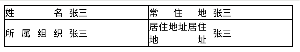
代码示例:
<style>
  .box { width: 500px; border: 1px solid; font-size: 0;
    display: flex; flex-wrap: wrap; /* 允许换行 */
  }
  .item { font-size: 16px; box-sizing: border-box; border: 1px solid;
    flex: 0 0 50%;
    display: flex;          /* 核心:启用 flex 容器 */
    align-items: center;    /* 核心:垂直居中 */
  }
  .title {
    width: 100px;
    text-align: justify;
    text-align-last: justify;
  }
  .value {
    padding-left: 10px;
  }
  .colon {
    height: 100%;
    border-left: 1px solid;
  }
</style>
<div class="box">
  <div class="item">
    <span class="title">姓名</span><span class="colon" /><span class="value">张三</span>
  </div>
  <div class="item">
    <span class="title">常住地</span><span class="colon" /><span class="value">张三</span>
  </div>
  <div class="item">
    <span class="title">所属组织</span><span class="colon"></span><span class="value">张三</span>
  </div>
  <div class="item">
    <span class="title">居住地址居住地址</span><span class="colon"></span><span class="value">张三</span>
  </div>
</div>
5.7 三行两列,文字右对齐,列宽度根据最多内容而定
3行2列内容,列都是右对齐,第一列宽度固定,第二列宽度跟行最大宽度而定
效果如下图所示:
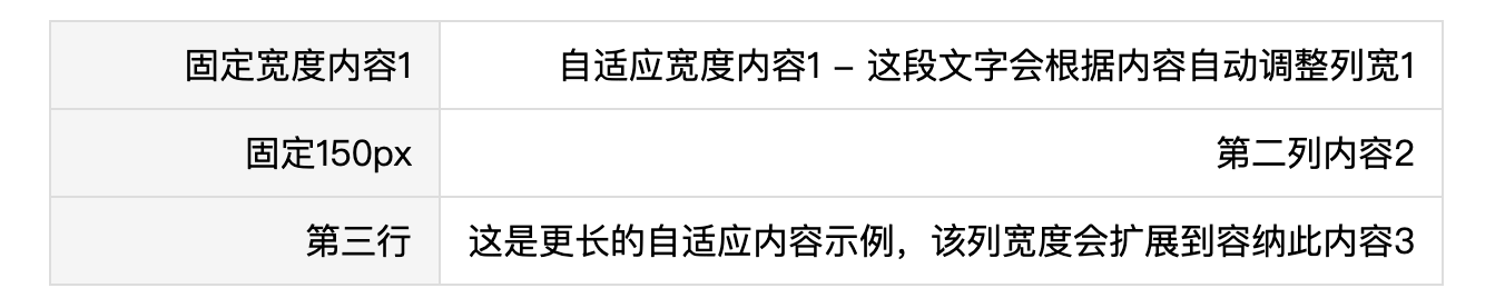
1、使用table标签实现
<style>
  .fixed-table {
    width: auto;
    border-collapse: collapse;
    margin: 20px;
  }

  .fixed-table td {
    padding: 8px 12px;
    border: 1px solid #ddd;
    text-align: right;
    white-space: nowrap; /*当宽度不够的时候,不换行*/
  }

  .fixed-table td:first-child {
    width: 150px;
    background-color: #f5f5f5;
  }
</style>
<table class="fixed-table">
  <tr>
    <td>固定宽度内容1</td>
    <td>自适应宽度内容1 - 这段文字会根据内容自动调整列宽1</td>
  </tr>
  <tr>
    <td>固定150px</td>
    <td>第二列内容2</td>
  </tr>
  <tr>
    <td>第三行</td>
    <td>这是更长的自适应内容示例,该列宽度会扩展到容纳此内容3</td>
  </tr>
</table>
2、使用flex实现:
<style>
  .flex-container {
    display: flex;
    flex-direction: column;
    width: 100%;
    max-width: 800px;
    margin: 20px auto;
    border: 1px solid #ddd;
  }

  .flex-row {
    display: flex;
    justify-content: flex-end;
    border-bottom: 1px solid #eee;
    padding: 10px 0;
  }

  .flex-row:last-child {
    border-bottom: none;
  }

  .fixed-col {
    width: 150px;
    text-align: right;
    padding-right: 15px;
    font-weight: bold;
    color: #333;
  }

  .auto-col {
    flex: 1;
    text-align: right;
    min-width: 0;
    /* 防止内容溢出 */
    color: #666;
  }
</style>
<div class="flex-container">
  <div class="flex-row">
    <div class="fixed-col">固定标题4:</div>
    <div class="auto-col">自适应内容1,长度会根据内容自动调整</div>
  </div>
  <div class="flex-row">
    <div class="fixed-col">固定标题5:</div>
    <div class="auto-col">这段内容比较长,会撑开第二列的宽度,但第一列始终保持150px固定宽度</div>
  </div>
  <div class="flex-row">
    <div class="fixed-col">固定标题6:</div>
    <div class="auto-col">短内容</div>
  </div>
</div>
6. 隐藏页面元素几种方法
1、display:none
.hidden{
    display:none
}
将元素设置为display:none后,元素在页面上将彻底消失,元素本来占有的空间就会被其他元素占有,也就是说它会导致浏览器的重排和重绘。
此方法有时可能会导致前端框架里面找不到这个元素。
2、visibility:hidden
.hidden{
    visibility:hidden
}
此方法也是一种常用的隐藏元素的方法,和display:none的区别在于,元素在页面消失后,其占据的空间依旧会保留着,所以它只会导致浏览器重绘而不会重排
visibility:hidden适用于那些元素隐藏后不希望页面布局会发生变化的场景
3、opacity:0
.hidden {
    opacity:0;
}
opacity属性表示元素的透明度,而将元素的透明度设置为0后,在我们眼中,元素也就是隐藏起来的,这也算是一种隐藏元素的方法
这种方法和visibility:hidden的一个共同点是元素隐藏后依旧占据着空间,但我们都知道,设置透明度为0后,元素只是隐身了,它依旧存在页面中
4、设置height、width等盒模型属性为0
将元素的margin,border,padding,height和width等影响元素盒模型的属性设置成0,如果元素内有子元素或内容,还应该设置其overflow:hidden来隐藏其子元素
.hidden {
    margin:0; border:0; padding:0;
    height:0; width:0;
    overflow:hidden;
}
jquery的slideUp动画,它就是设置元素的overflow:hidden后,接着通过定时器,不断地设置元素的height,margin-top,margin-bottom,border-top,border-bottom,padding-top,padding-bottom为0,从而达到slideUp的效果
6.1 元素隐藏后的事件响应
<style>
    div {
        width: 100px;
        height: 100px;
        background: red;
        margin: 15px;
        padding: 10px;
        border: 5px solid green;
        display: inline-block;
        overflow: hidden;
    }
    .none { display: none; }
    .hidden { visibility: hidden; }
    .opacity0 { opacity: 0; }
    .height0 { height: 0; }
</style>

<div class="none"></div>
<div class="hidden"></div>
<div class="opacity0"></div>
<div class="height0">aa</div>

<script src="https://cdnjs.cloudflare.com/ajax/libs/jquery/3.0.0/jquery.min.js"></script>
<script>
    $(".none").on("click", function () {
        console.log("none clicked");
    })
    $(".hidden").on("click", function () {
        console.log("hidden clicked");
    })
    $(".opacity0").on("click", function () {
        console.log("opacity0 clicked");
    })
    $(".height0").on("click", function () {
        console.log("height0 clicked");
    })
</script>
这段代码将四种隐藏元素的方法分别展示出来,然后绑定其点击事件,经过测试,主要有下面的结论:
这段代码将四种隐藏元素的方法分别展示出来,然后绑定其点击事件,经过测试,主要有下面的结论:
display:none:元素彻底消失,很显然不会触发其点击事件visibility:hidden:无法触发其点击事件,有一种说法是display:none是看不见摸不着,而visibility:hidden是看不见摸得着,这种说法是不准确的,设置元素的visibility后无法触发点击事件,说明这种方法元素也是消失了,只是依然占据着页面空间opacity:0:可以触发点击事件,原因也很简单,设置元素透明度为0后,元素只是相对于人眼不存在而已,对浏览器来说,它还是存在的,所以可以触发点击事件height:0:将元素的高度设置为0,并且设置overflow:hidden。使用这种方法来隐藏元素,是否可以触发事件要根据具体的情况来分析。如果元素设置了border,padding等属性不为0,很显然,页面上还是能看到这个元素的,触发元素的点击事件完全没有问题。如果全部属性都设置为0,很显然,这个元素相当于消失了,即无法触发点击事件
但是这些结论真的准确吗?
我们在上面的代码中添加这样一句代码:$(".none").click()
结果发现,触发了click事件,也就是通过JS可以触发被设置为display:none的元素的事件。
所以前面无法触发点击事件的真正原因是鼠标无法真正接触到被设置成隐藏的元素
6.2 CSS3 transition对这几种方法的影响
CSS3提供的transition极大地提高了网页动画的编写,但并不是每一种CSS属性都可以通过transition来进行动画的。我们修改代码如下:
<style>
    div {
        width: 100px;
        height: 100px;
        background: red;
        margin: 15px;
        padding: 10px;
        border: 5px solid green;
        display: inline-block;
        overflow: hidden;
        transition: all linear 2s;
    }
</style>

<div class="none"></div>
<div class="hidden"></div>
<div class="opacity0"></div>
<div class="height0">aa</div>

<script src="https://cdnjs.cloudflare.com/ajax/libs/jquery/3.0.0/jquery.min.js"></script>
<script>
$(".none").on("click", function () {
    console.log("none clicked");
    $(this).css("display", "none");
})
$(".hidden").on("click", function () {
    console.log("hidden clicked");
    $(this).css("visibility", "hidden");
})
$(".opacity0").on("click", function () {
    console.log("opacity0 clicked");
    $(this).css("opacity", 0);
})
$(".height0").on("click", function () {
    console.log("height0 clicked");
    $(this).css({
        "height": 0,
    });
})
</script>
经过测试,可以看到:
display:none:完全不受transition属性的影响,元素立即消失visibility:hidden:元素消失的时间跟transition属性设置的时间一样,但是没有动画效果opacity和height等属性能够进行正常的动画效果
假设我们要通过CSS3来做一个淡出的动画效果,应该如下:
.fadeOut { visibility: visible; opacity: 1; transition: all linear 2s; }
.fadeOut:hover { visibility: hidden; opacity: 0; }
应该同时设置元素的visibility和opacity属性
参考资料:https://segmentfault.com/a/1190000007542357
7. 修改网站为(黑白)灰色代码
<style>
html {
  /* //以下代码通过滤镜将页面中所有的彩色去掉,适用于各种纪念日,请维护人员及时删除或注释掉 */
  filter:progid:DXImageTransform.Microsoft.BasicImage(grayscale=1);
  filter: grayscale(100%);
  -webkit-filter: grayscale(100%);
  -moz-filter: grayscale(100%);
  -ms-filter: grayscale(100%);
  -o-filter: grayscale(100%);
  filter: gray;
  -webkit-filter: grayscale(1);
  /* //去彩色代码结束 */
}
</style>
8. 三角形效果
/** 正三角 */
.triangle {
  width: 0;
  height: 0;
  border-style: solid;
  border-width: 0 25px 40px 25px;
  border-color: transparent transparent rgb(245, 129, 127) transparent;
}

/** 倒三角 */
.triangle {
  width: 0;
  height: 0;
  border-style: solid;
  border-width: 40px 25px 0 25px;
  border-color:  rgb(245, 129, 127) transparent transparent transparent;
}
效果:
9. 虚线效果
 .dotted-line{
     border: 1px dashed transparent;
     background: linear-gradient(white,white) padding-box, repeating-linear-gradient(-45deg,#ccc 0, #ccc .25em,white 0,white .75em);
 }
效果:
10. 优惠券效果
 .coupon{
   width: 300px;
   height: 100px;
   position: relative;
   background: radial-gradient(circle at right bottom, transparent 10px, #ffffff 0) top right /50% 51px no-repeat,
     radial-gradient(circle at left bottom, transparent 10px, #ffffff 0) top left / 50% 51px no-repeat,
     radial-gradient(circle at right top, transparent 10px, #ffffff 0) bottom right / 50% 51px no-repeat,
     radial-gradient(circle at left top, transparent 10px, #ffffff 0) bottom left / 50% 51px no-repeat;
   filter: drop-shadow(2px 2px 2px rgba(0,0,0,.2));
 }
效果:
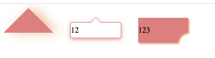
11. 气泡阴影、缺圆投影效果
// 三角形阴影
 .shadow-triangle{
     width: 0;
     height: 0;
     border-style: solid;
     border-width: 0 50px 50px 50px;
     border-color: transparent transparent rgb(245, 129, 127) transparent;
     filter:drop-shadow(10px 0px 10px  rgba(238, 125, 55,0.5));
 }

 // 缺圆投影
 .circle-square{
     width:100px;
     height:50px;
     line-height: 50px;
     background: radial-gradient(circle at bottom right, transparent 20px, rgb(245, 129, 127) 15px);
     filter: drop-shadow(2px 2px 2px rgba(238, 132, 66, 0.9));
 }

 // 气泡阴影
 .tip {
     width: 100px;
     height: 30px;
     line-height: 30px;
     border: 1px solid rgb(245, 129, 127);
     border-radius: 4px;
     position: relative;
     background-color: #fff;
     filter: drop-shadow(0px 2px 4px rgba(245, 129, 127, 0.9));
     &::before {
       content: "";
       width: 0;
       height: 0;
       border-style: solid;
       border-width: 0 10px 10px 10px;
       border-color: transparent transparent #fff transparent;
       position: absolute;
       top: -10px;
       left: 0;
       right: 0;
       margin: auto;
       z-index: 2;
     }
     &::after {
       content: "";
       width: 0;
       height: 0;
       border-style: solid;
       border-width: 0 10px 10px 10px;
       border-color: transparent transparent rgb(245, 129, 127) transparent;
       position: absolute;
       top: -11px;
       left: 0;
       right: 0;
       margin: auto;
       z-index: 1;
     }
 }
效果: